candid turns 14
It's our 14th birthday today!! Just like any typical 14-year-old, we need lots of snacks and sleep and some may say we are a bit loud and rambunctious...
#candidbranded Series: Hello Baby!
The TMC Charitable Foundation engaged with candid to develop an integrated marketing communications plan for TMC – Lakewood FamilyBirthplace. The plan included the creation of a meaningful brand strategy and campaign name — Hello Baby!
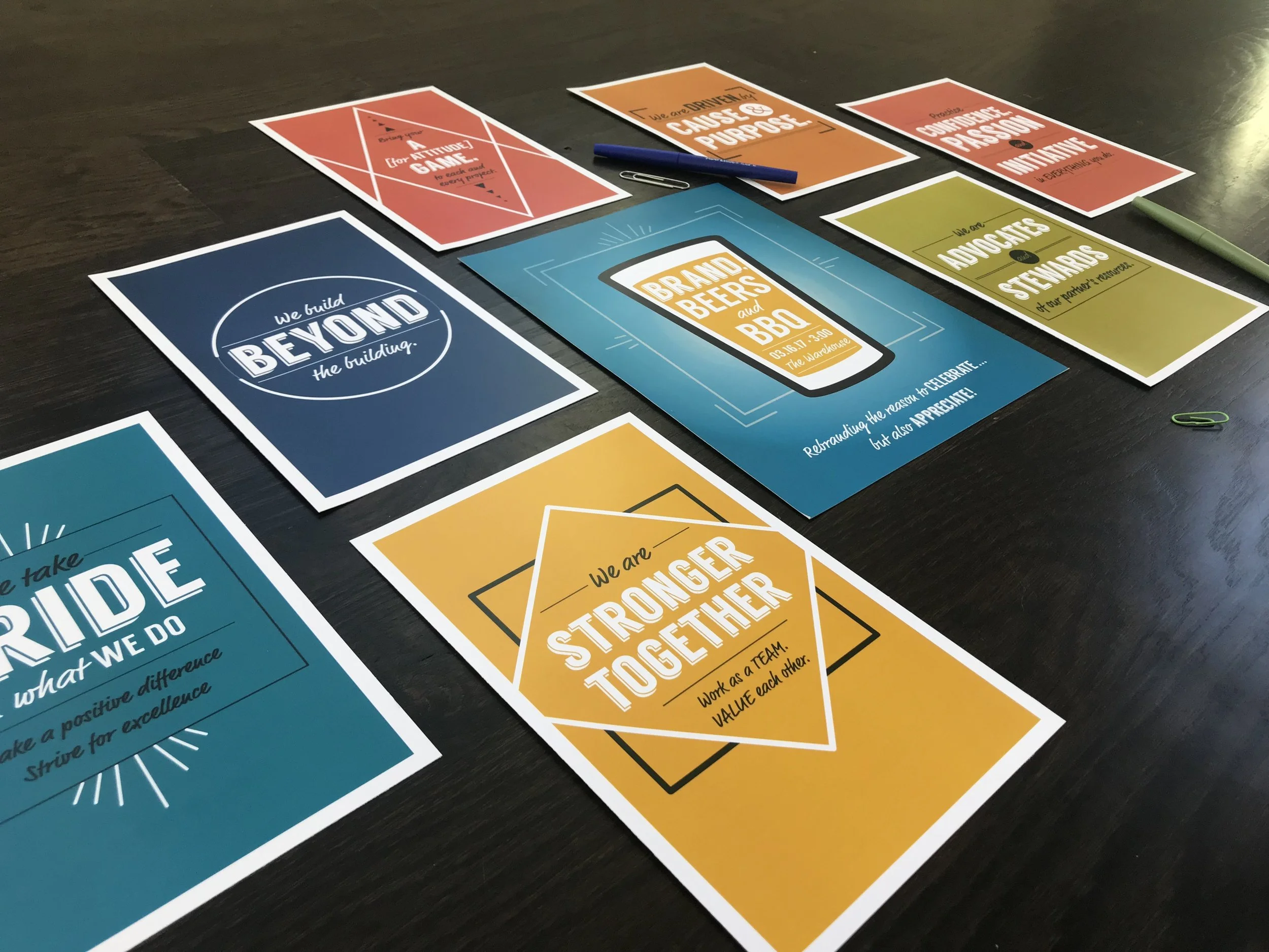
#candidbranded Series: Beer and Brands
This campaign was to create excitement internally for a company who was going through a renaming and rebranding process.
25 under 25 alumni among Fountain Award winners
Several area companies were recognized in March as Fountain Award winners. The awards highlight programs and campaigns focused on advertising and marketing.
candid Wins Top Awards
candid was recently honored with two Fountain Awards and three Certificates of Merit from the Association of National Advertisers/American Marketing Association of Kansas City (ANAKC/AMAKC) at the annual Fountain Awards.
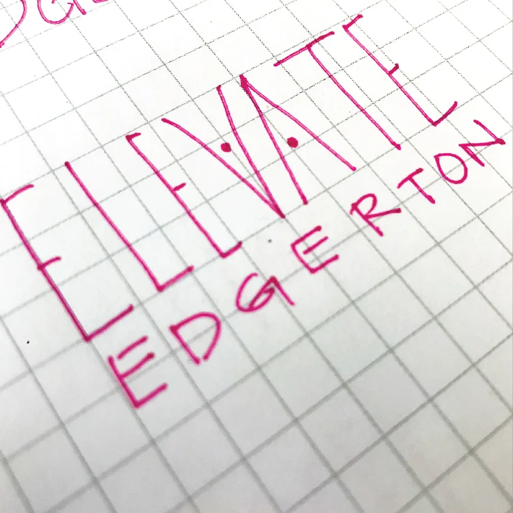
#candidbranded Series: ElevateEdgerton!
candid was tasked to name and create the branding for the organization. Keeping the branding of the city in mind, complementary colors and language was used in the ElevateEdgerton! brand.
#candidbranded Series: Kansas City Data Centers
This project was an integrated campaign to attract data centers while educating and communicating the benefits of locating to the KCP&L service territory.
#candidbranded Series: City of Edgerton
The City of Edgerton was looking for a new and fresh logo/brand to go along with some major changes that were happening in the city — particularly a huge project that would dramatically change the community — which was underway.
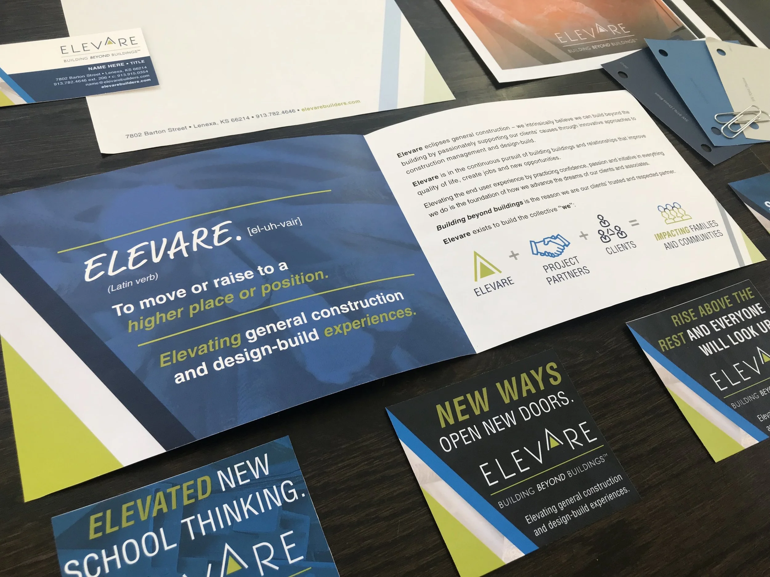
#candidbranded Series: Elevare
With new leadership, a local construction company was looking to rename and rebrand. This 20+ year-old company had many relationships in the local market, but was looking to expand its footprint into other markets.
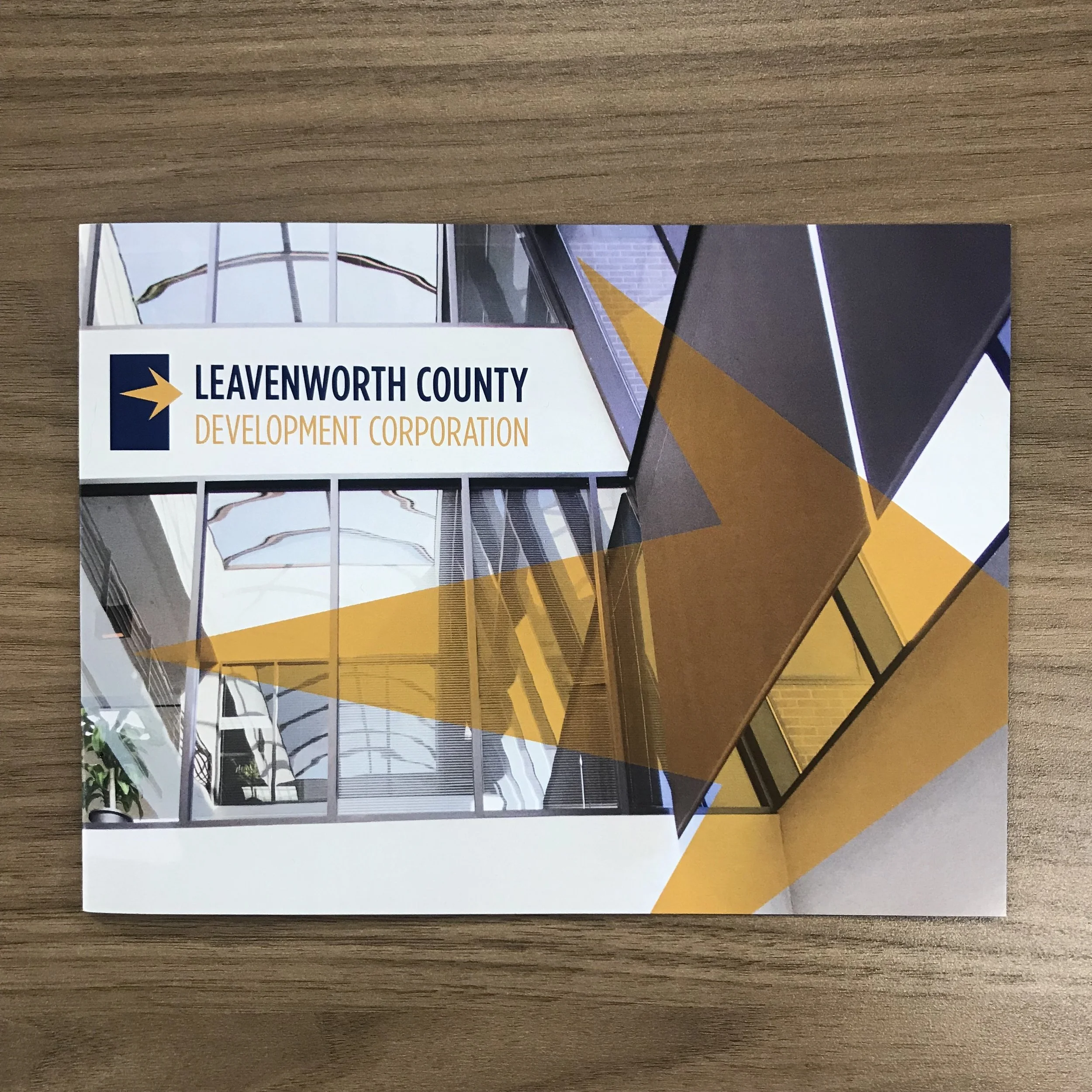
#candidbranded Series: Leavenworth County Development Corporation
For LCDC, we refreshed the messaging and updated the organization’s branding including building a library of photos.

