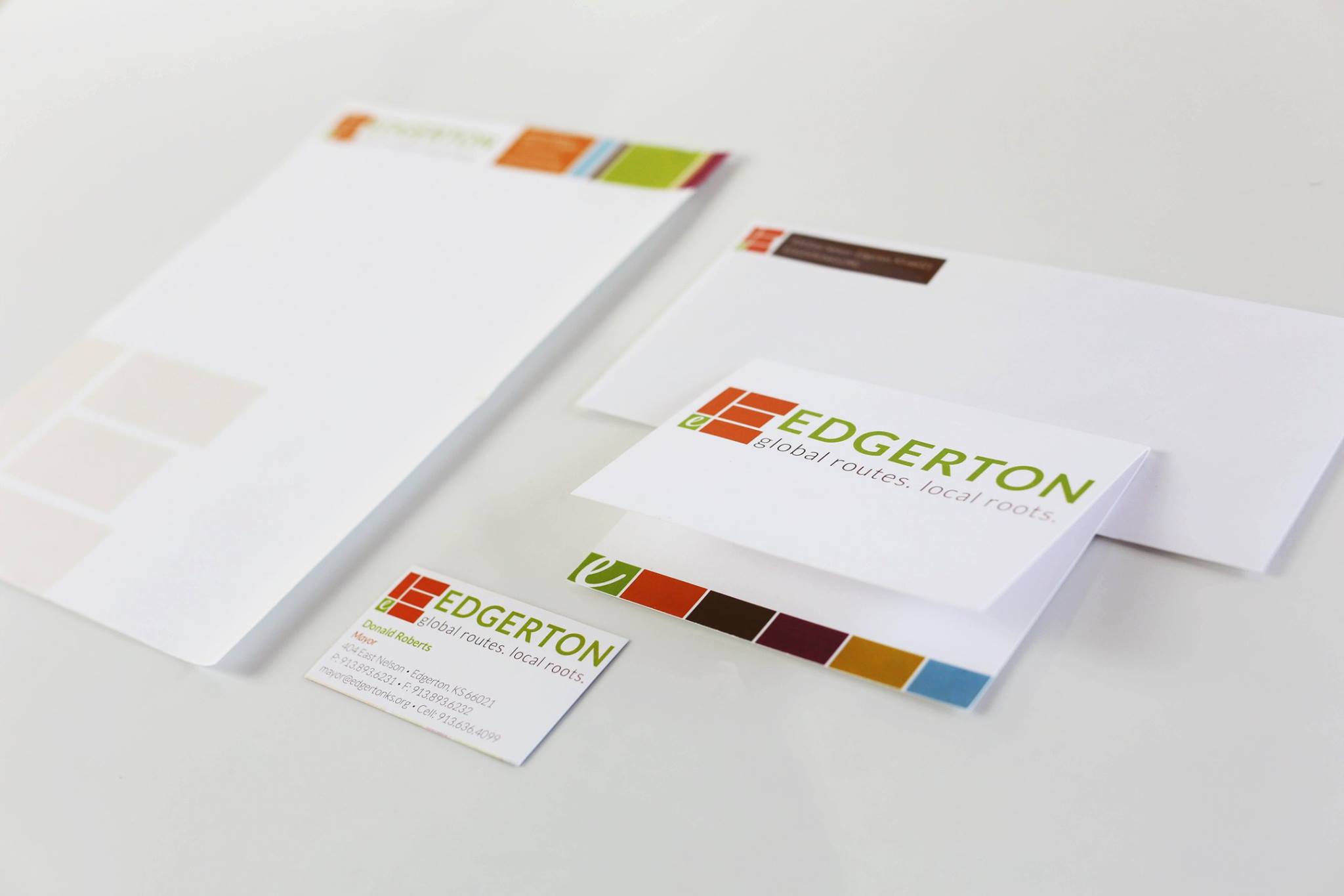
#candidbranded Series: City of Edgerton
The City of Edgerton was looking for a new and fresh logo/brand to go along with some major changes that were happening in the city — particularly a huge project that would dramatically change the community — which was underway. After winning the project through a competitive RFP process, candid went to work on creating a new brand for the City of Edgerton, KS.
We started this project by diving into the city with on the street interviews and holding many meetings to understand the culture and history of the community. From these insights, we then created a brand position, tagline and logo concepts. The Edgerton brand is the product of the experiences, attitudes, values and integrity of the people that call this place home.
The colors selected were based on a variety of factors including, community feedback (i.e., orange was the former Edgerton high school color) and colors that represented a warmness or welcoming feel.
Unlike other communities, Edgerton is progressive and thoughtful. The logo is original, not typical and unique to community branding. The mark represents Edgerton with a small green square pulled out for the representation of the city in the SW corner of the county.


