#candidbranded Series: The Monarch
Our client, St. Louis Development Corporation (SLDC), needed branding for a workforce and training campus for manufacturing and other high-paying, in-demand careers. Our task was to create a name and brand that would be used for the center. The language in the brand position sets the tone for all the marketing efforts going forward.
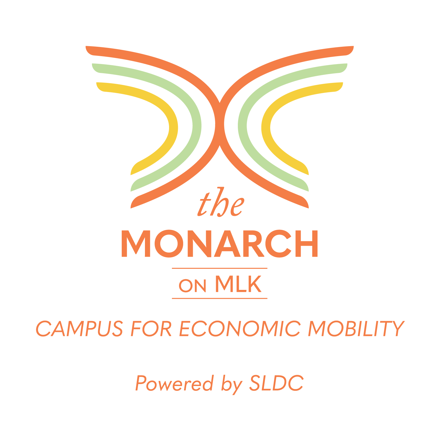
The symbolism for the name “The Monarch on MLK” is that a butterfly represents a sign of hope and transformation. This is true of what the center means to this area and the people living there. The logo has a custom mark created by a stylized sequence of arches that make up the monarch “butterfly” graphic. These show movement and the ripple effect the campus will have on the community.