#candidbranded Series: North Kansas City
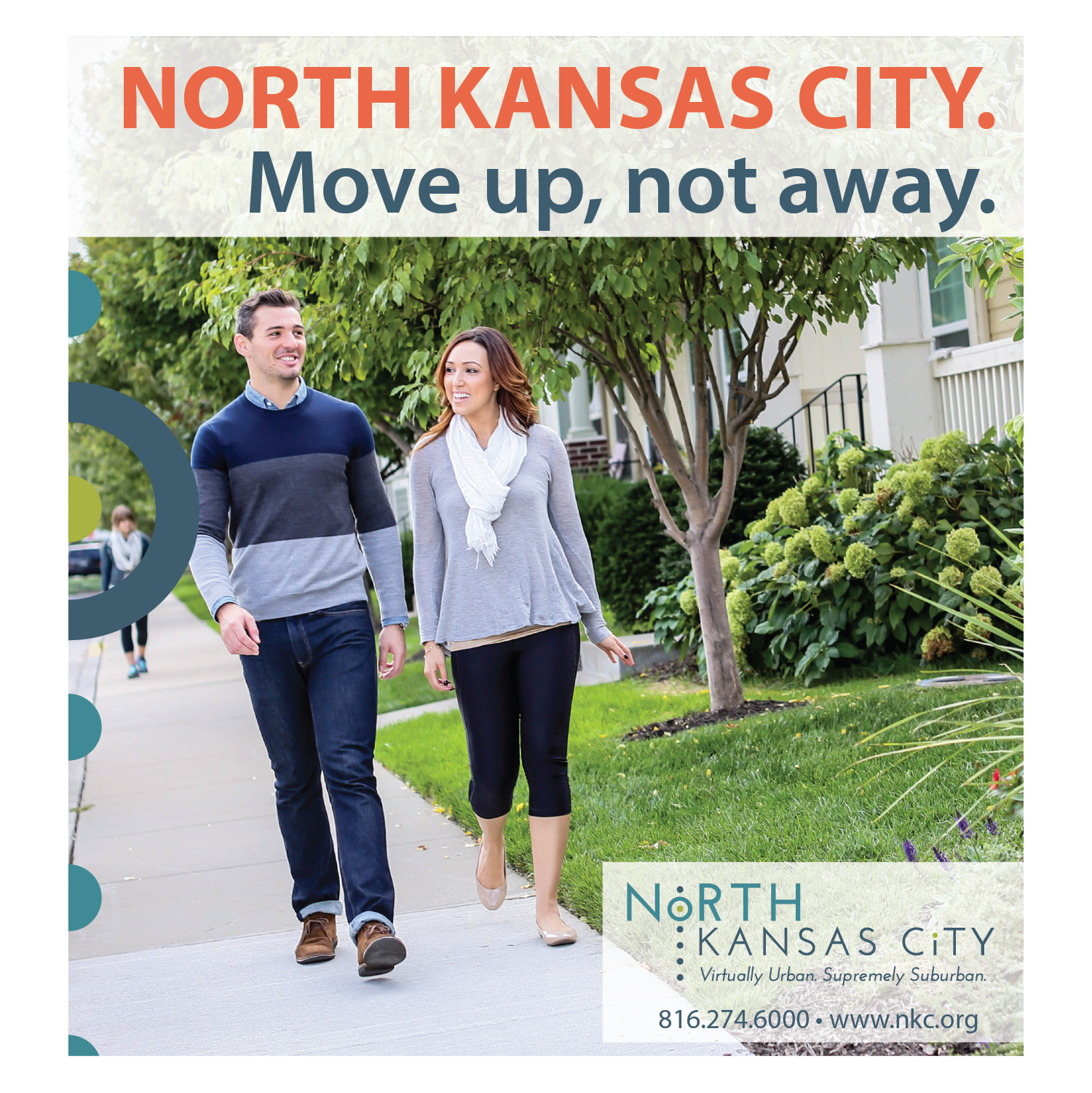
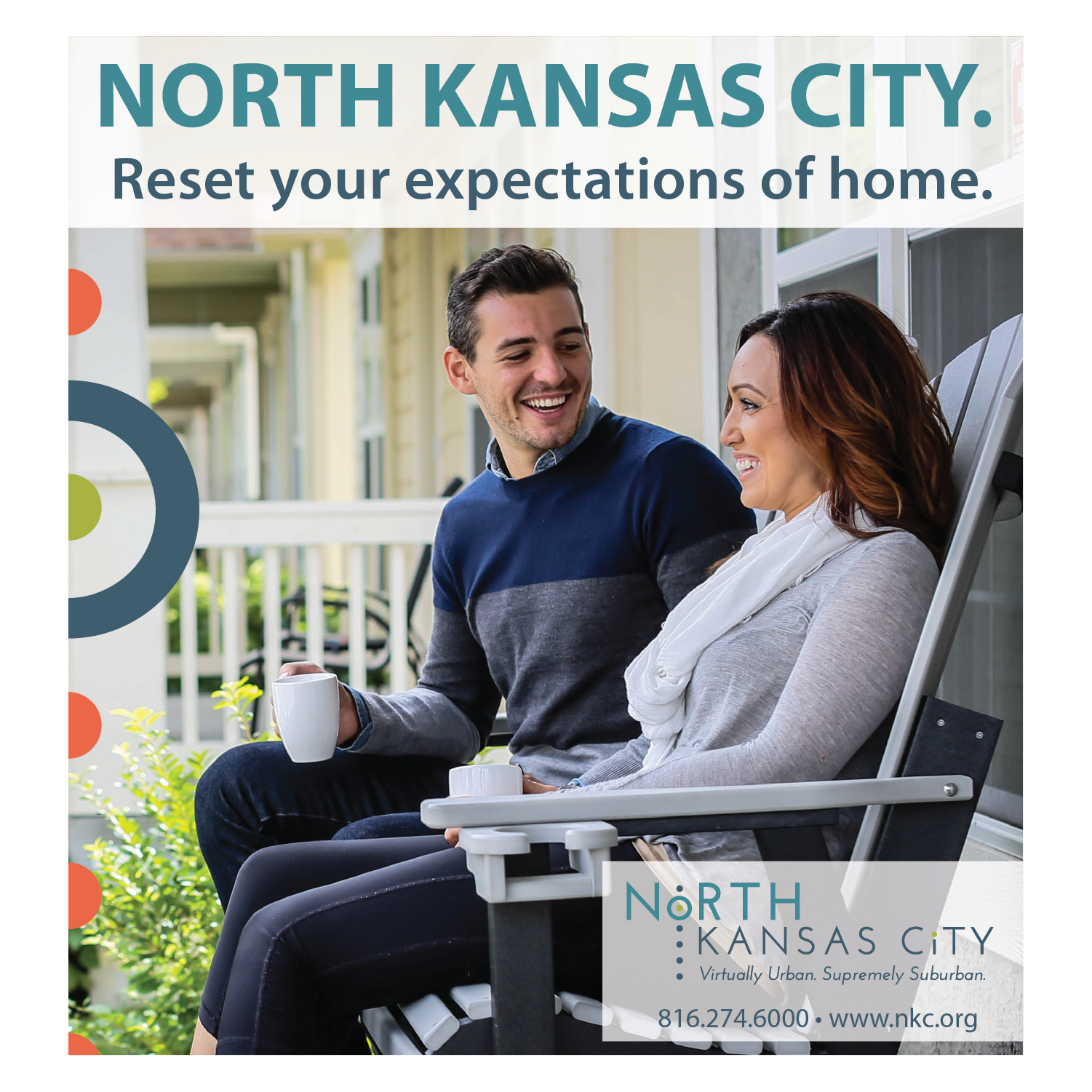
The City of North Kansas City, Missouri engaged candid to create a unique brand identity and memorable message that reached a broad and diverse audience. The objective was to increase the City’s brand recognition with the Greater Kansas City region within a younger demographic as an alternative to living in the River Market or Crossroads districts.
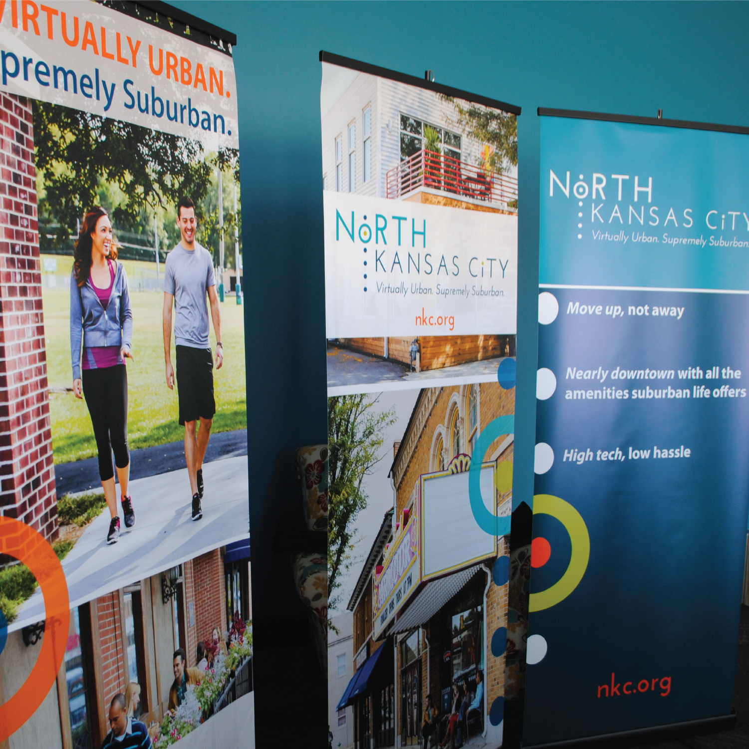
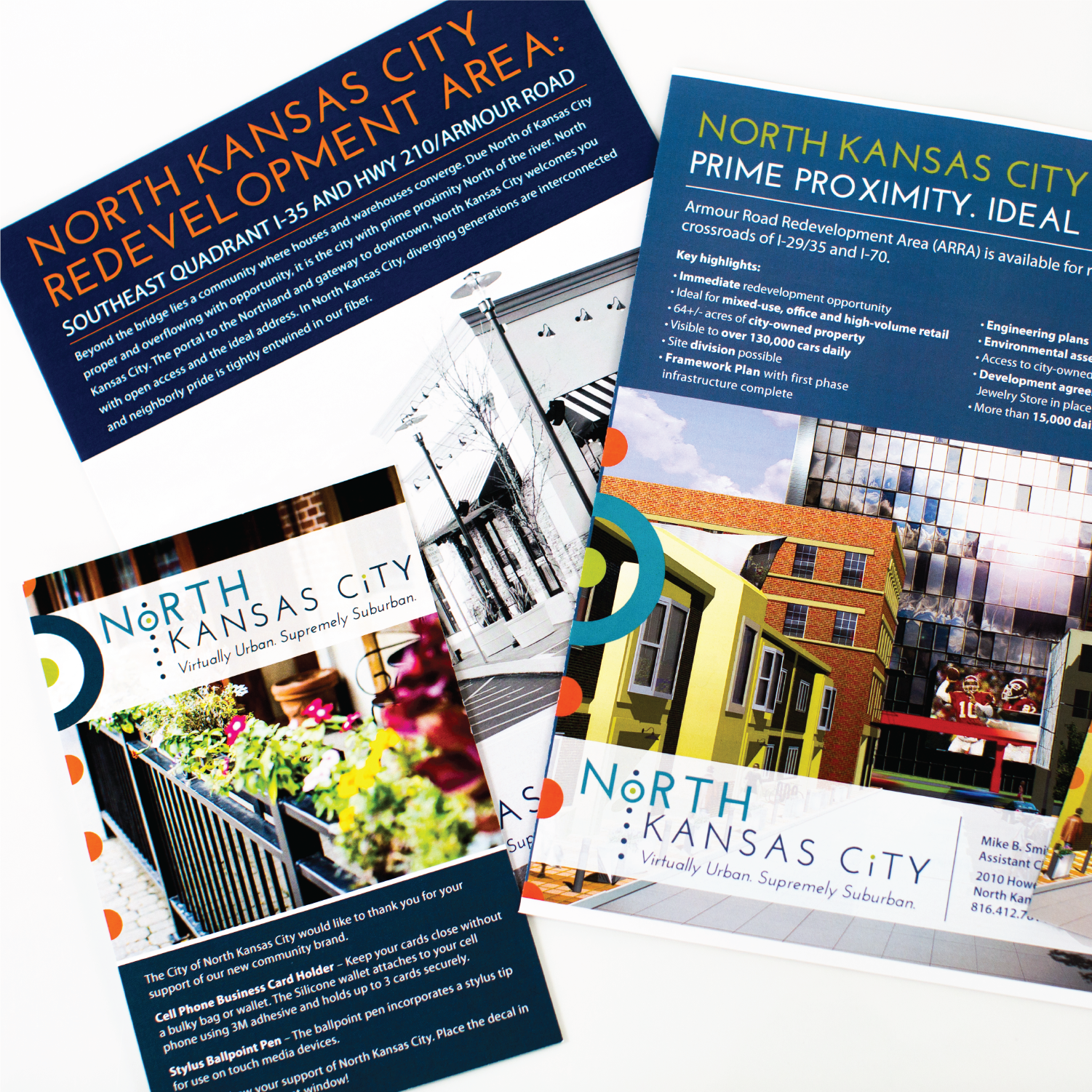
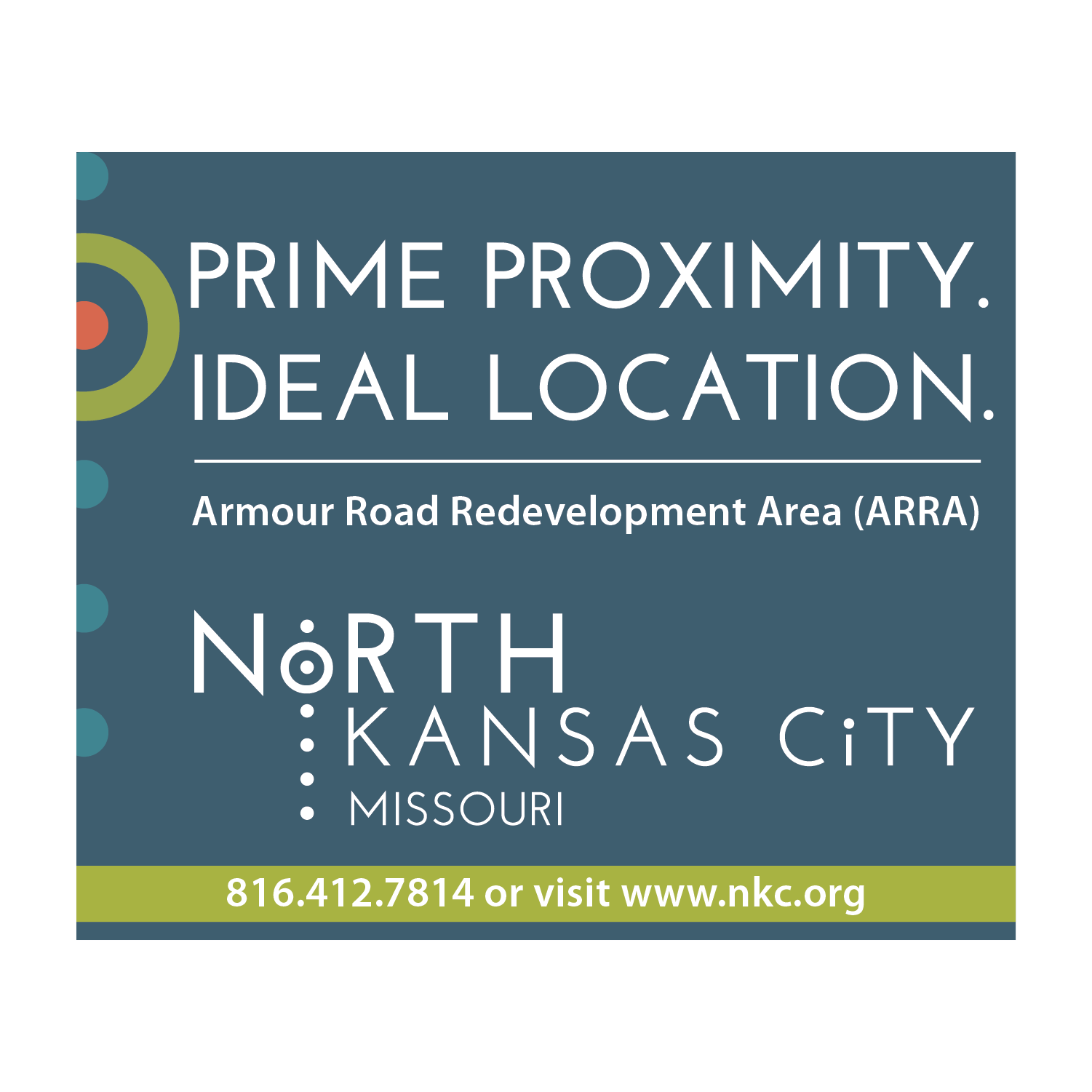
The tagline for North Kansas City had to be able to describe that it is compelling place to live and work for those seeking an urban environment with suburban amenities. The City has the quality of life indicators that will attract emerging leaders who will bring or start businesses near the place they want to live. North Kansas City has quality parks and cultural and healthy lifestyle activities attract young people with an ease of accessibility to all points within the Kansas City metro area makes its location an important distinction. North Kansas City is virtually urban, supremely suburban
The logo utilizes a series of dots showing movement to the North with the center of the dot representing North Kansas City’s proximity as a central location. It uses a clean typeface that is clean and easy to read. The mark uses a unique mix of font and graphical elements that are not typical for a City. The color palette for North Kansas City is contemporary with its use of jewel tones. The palette has a modern, youthful feel. There is an approachable, casual comfort to these strong colors, just like North Kansas City.
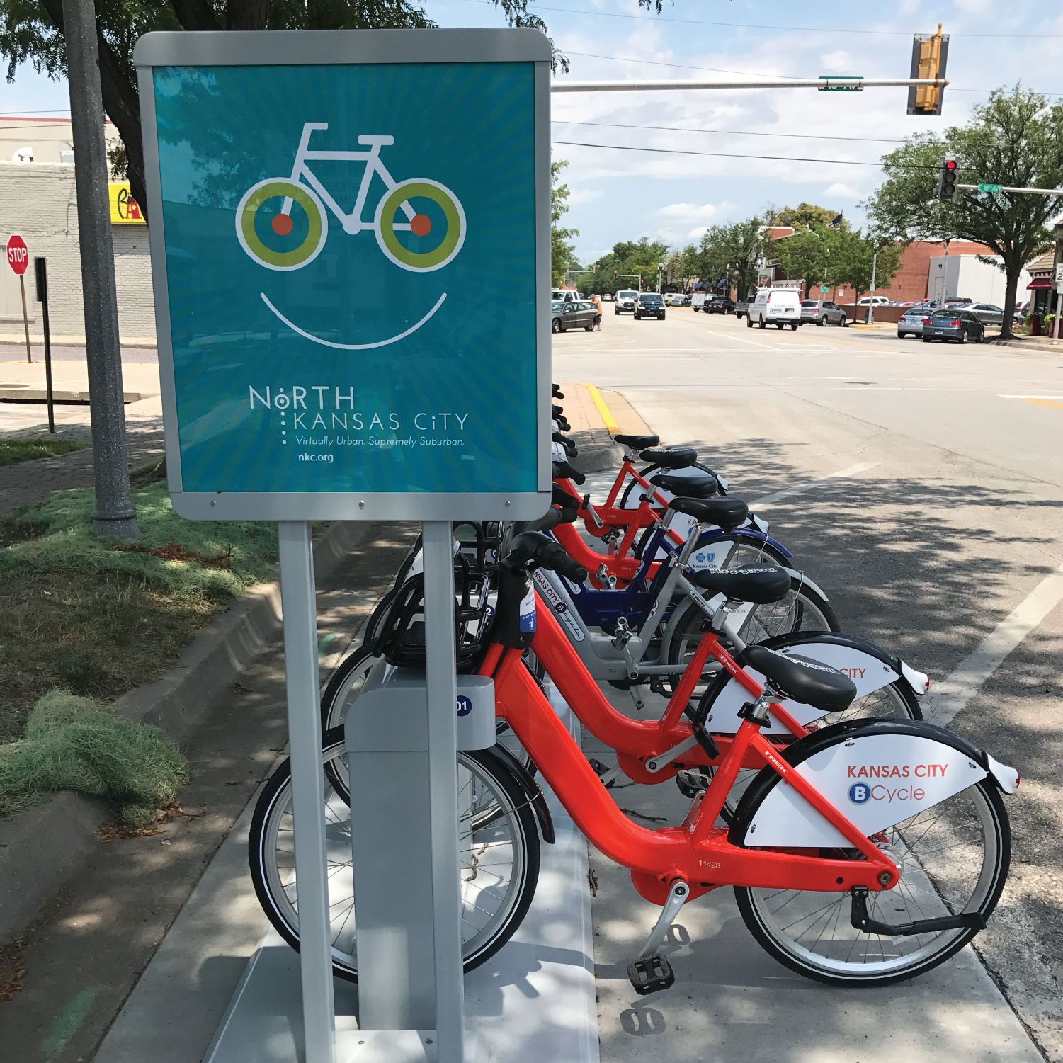
The City continued working with candid, while developing a campaign for the RideKC bike hubs that are located in the city. Posters and bike graphics were created to use at these hubs. Elements of the brand were used in a playful way to create excitement for the bikes.